Before-
After-
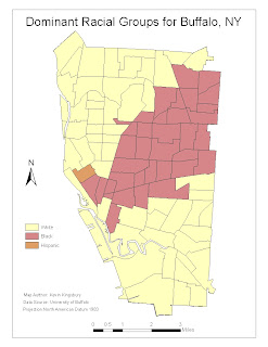
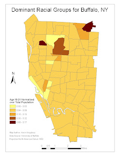
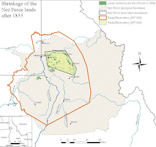
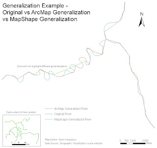
For the maps created in Lab 1, I followed instructor guidance and cartographic convention in the redesign of the maps.
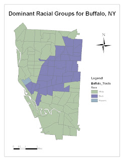
• The purpose of the map in Task 1 is to show, qualitatively and quantitatively, the distribution of races in Buffalo, NY. For the map in Task 1A, I added map author, data source, and projection information. I also changed the color scale to better represent the differences between races.
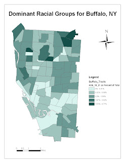
• For the map in Task 1B, I added map author, data source, and projection information as well. I also cleaned up the legend.
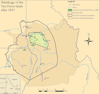
• The purpose of the map in Task 2 was to highlight boundaries changes in the Nez Perce lands after 1855. For the map in Task 2, I changed the background colors, added a scale bar on the inset map, and made labels and borders more clear in the map and legend.
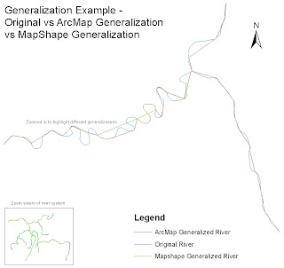
• The purpose of the map in Task 3 was to show the difference between generalization methods on a river system. For the map in Task 3, I added scale bars for the primary map and inset map and added map author and data source information.
Lab 2
Before:
After:
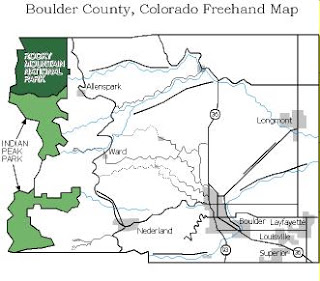
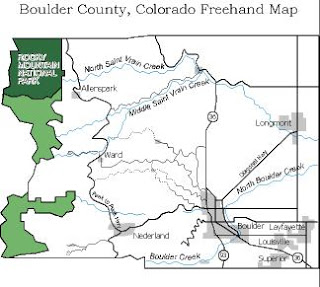
The purpose of the map in Lab 2 was to show, at a very generalized level, prominent geographic features in Boulder County, Colorado. The only change I made was based on instructor comments, and it was the addition of the label “Indian Peaks Park” to the Freehand drawing.
Lab 3
Before-
After-
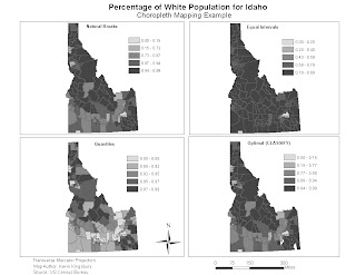
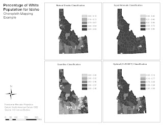
The purpose of the map for Lab 3 was to show the percentage of white population in Idaho under various classification methods. The changes I made to the map were based on instructor comments and cartographic convention. The changes include:
• Making legend box without gaps
• Remove “classification” from each method title
• Enlarge maps to remove white space
• Re-arrange drawings and put the Title on top of the drawings and data source, arrow, and scale bar on the bottom
• Adjusted the scale bar to make more useful increments